Massilia Type Poster
2022 Typography Project
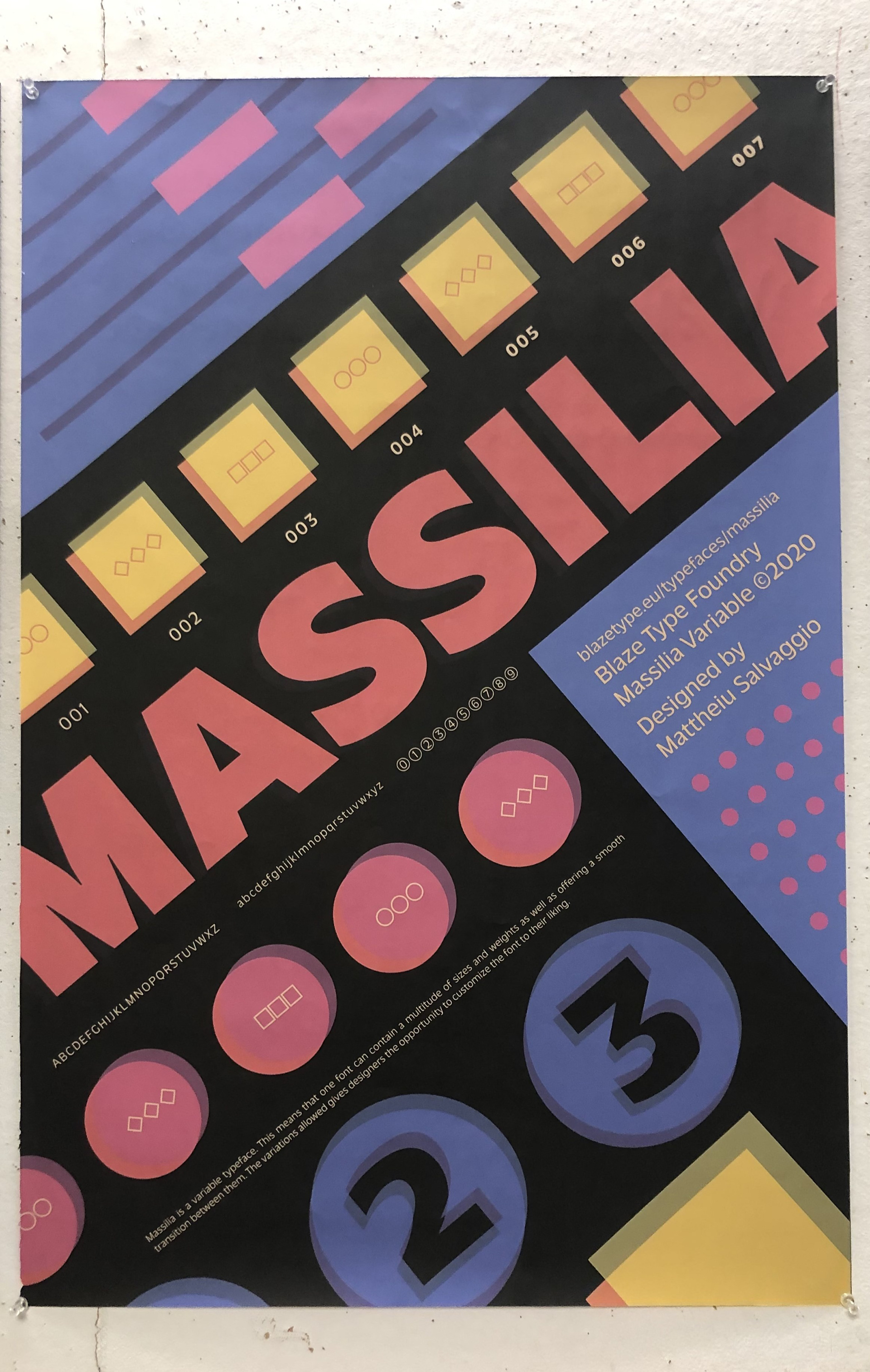
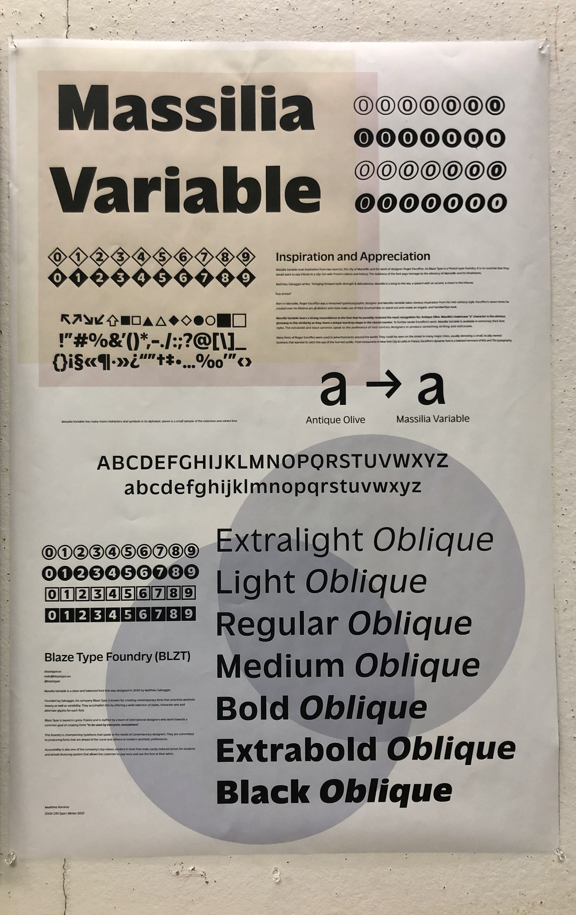
Creating a poster to celebrate a type face was an impactful learning experience as I came away from the project with a greater understanding of typography design as well as composition and hierarchy. My poster features the variable typeface 'Massilia', created by Blaze Type Foundry.
![](https://cdn.myportfolio.com/e582f9ee-eec6-4612-a087-5709729f3f68/bfcf3b9f-3358-475c-8e07-d10fb5c4e1cf_rw_1920.png?h=9f3368d7da2d61aacffd7727393b4ebe)
![](https://cdn.myportfolio.com/e582f9ee-eec6-4612-a087-5709729f3f68/8464336d-8ebe-402e-9929-5ae17b58cc67_rw_1920.png?h=adf74b620c42472f25d7467dfc7b9491)
![](https://cdn.myportfolio.com/e582f9ee-eec6-4612-a087-5709729f3f68/83e641da-7be9-4ab7-addc-8f5532f83f6d_rw_1200.png?h=158e58eddf0ac4f50dac7dbeb882f606)
![](https://cdn.myportfolio.com/e582f9ee-eec6-4612-a087-5709729f3f68/9af2f1e1-8ba3-496b-aafe-0d18f064841a_rw_1200.png?h=fa465563fff87fd9127b41db79383069)
![](https://cdn.myportfolio.com/e582f9ee-eec6-4612-a087-5709729f3f68/697073e8-48ae-46fb-bec7-c6eeb8060287_rw_1200.png?h=90c5025ad139667058a783548512ec91)
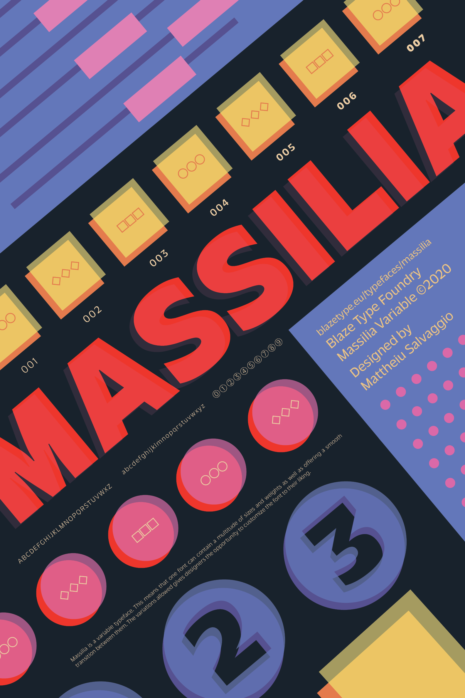
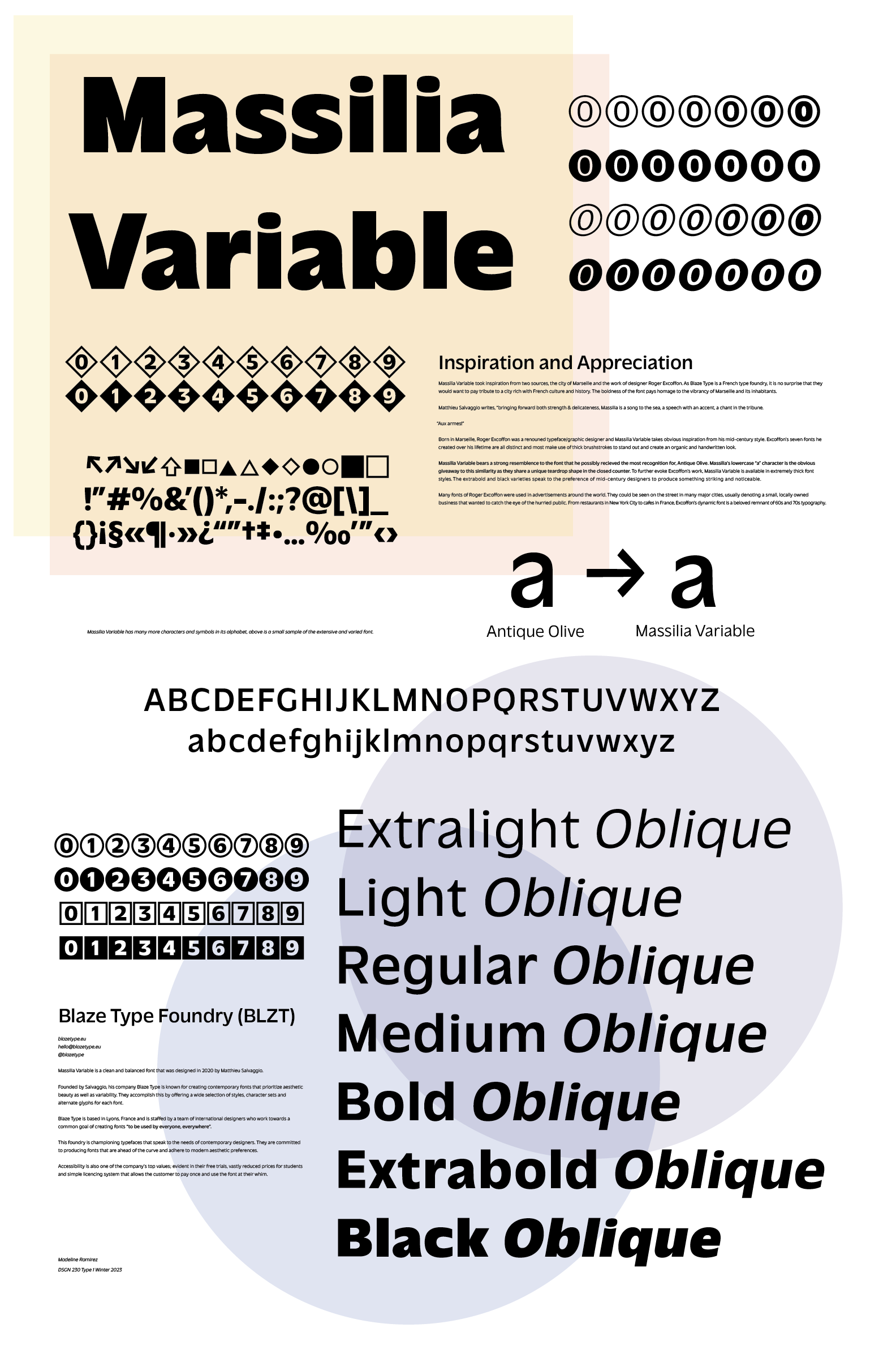
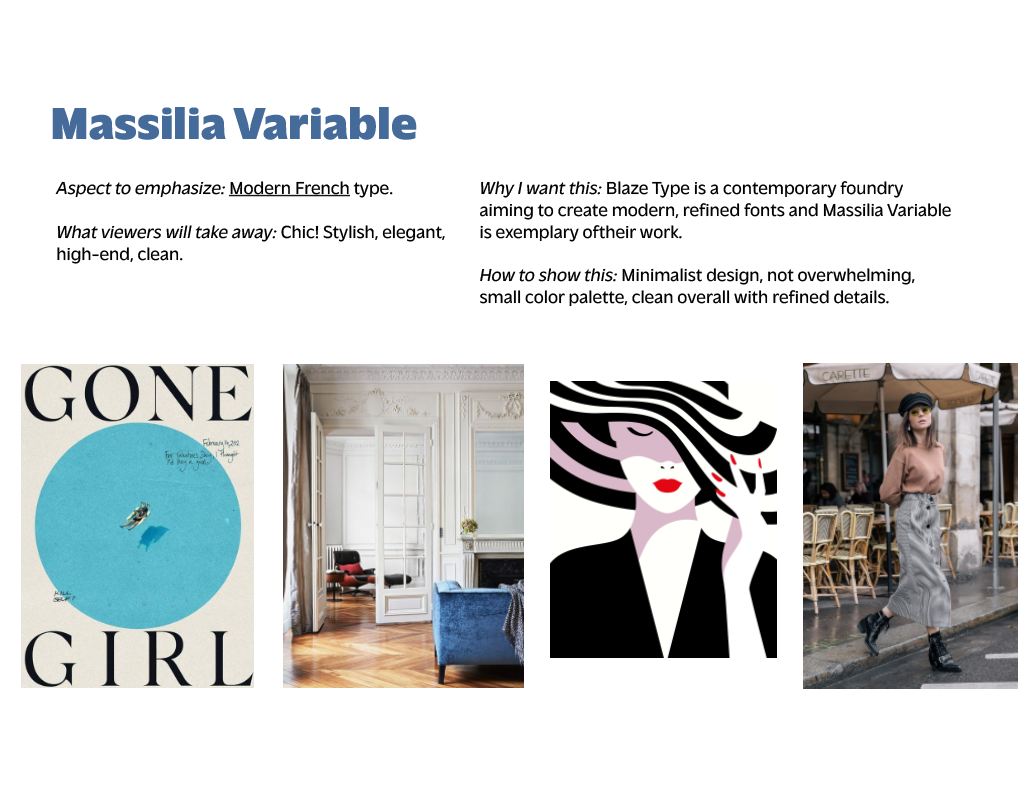
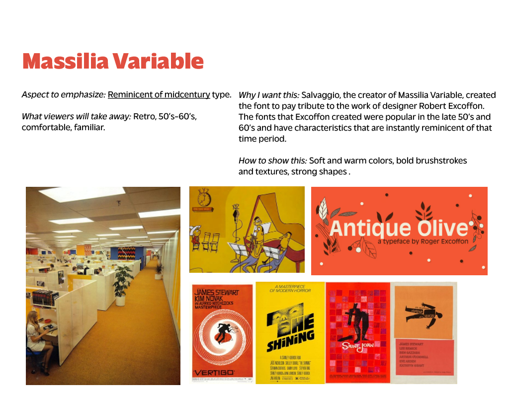
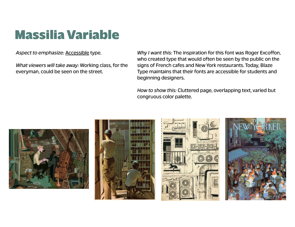
After doing research on the typeface, I concluded that it was inspired by two sources-the work of designer Roger Excoffon and the French city of Marseilles, Excoffon's hometown. Knowing this, I came up with three possible directions to take my poster.
![](https://cdn.myportfolio.com/e582f9ee-eec6-4612-a087-5709729f3f68/7829a16d-26ea-4677-87cb-47e6aae293dd_rw_1200.png?h=488b1657632e7a83d1c787e2105f2618)
![](https://cdn.myportfolio.com/e582f9ee-eec6-4612-a087-5709729f3f68/8fa29366-306d-4d68-b914-a70e3ea4e9b6_rw_1920.jpg?h=aad5adf8f451a66c2ec5fe202f66c3b1)
![](https://cdn.myportfolio.com/e582f9ee-eec6-4612-a087-5709729f3f68/0260555a-b1a5-4ba1-807b-ac663f1a4724_rw_1920.png?h=b8bc8fd7ee3ef770a800ab8276dd5997)
![](https://cdn.myportfolio.com/e582f9ee-eec6-4612-a087-5709729f3f68/f919ffdb-c191-489c-9065-a5653ca22ea5_rw_1920.png?h=aea12380876a267304c57c5789092b9c)
![](https://cdn.myportfolio.com/e582f9ee-eec6-4612-a087-5709729f3f68/82d90a0e-c7d5-4db7-819d-10cd029c0a33_rw_1920.png?h=11ef9aaff104e207c207615c3e7948b1)
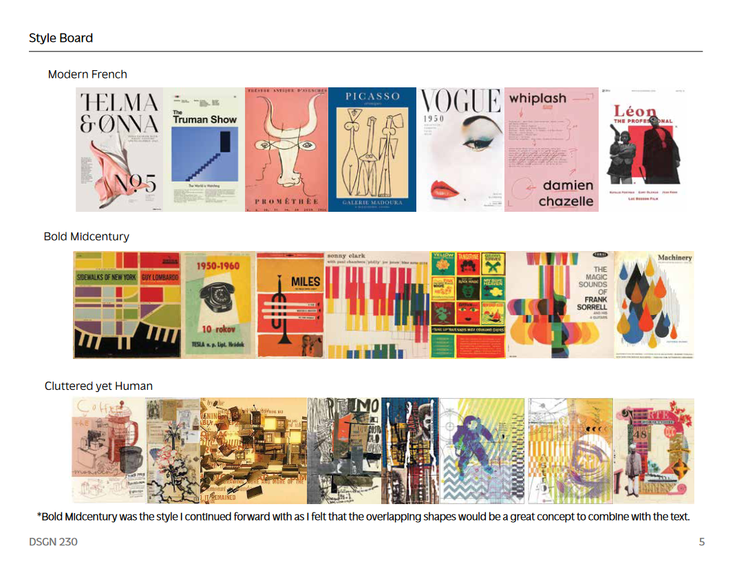
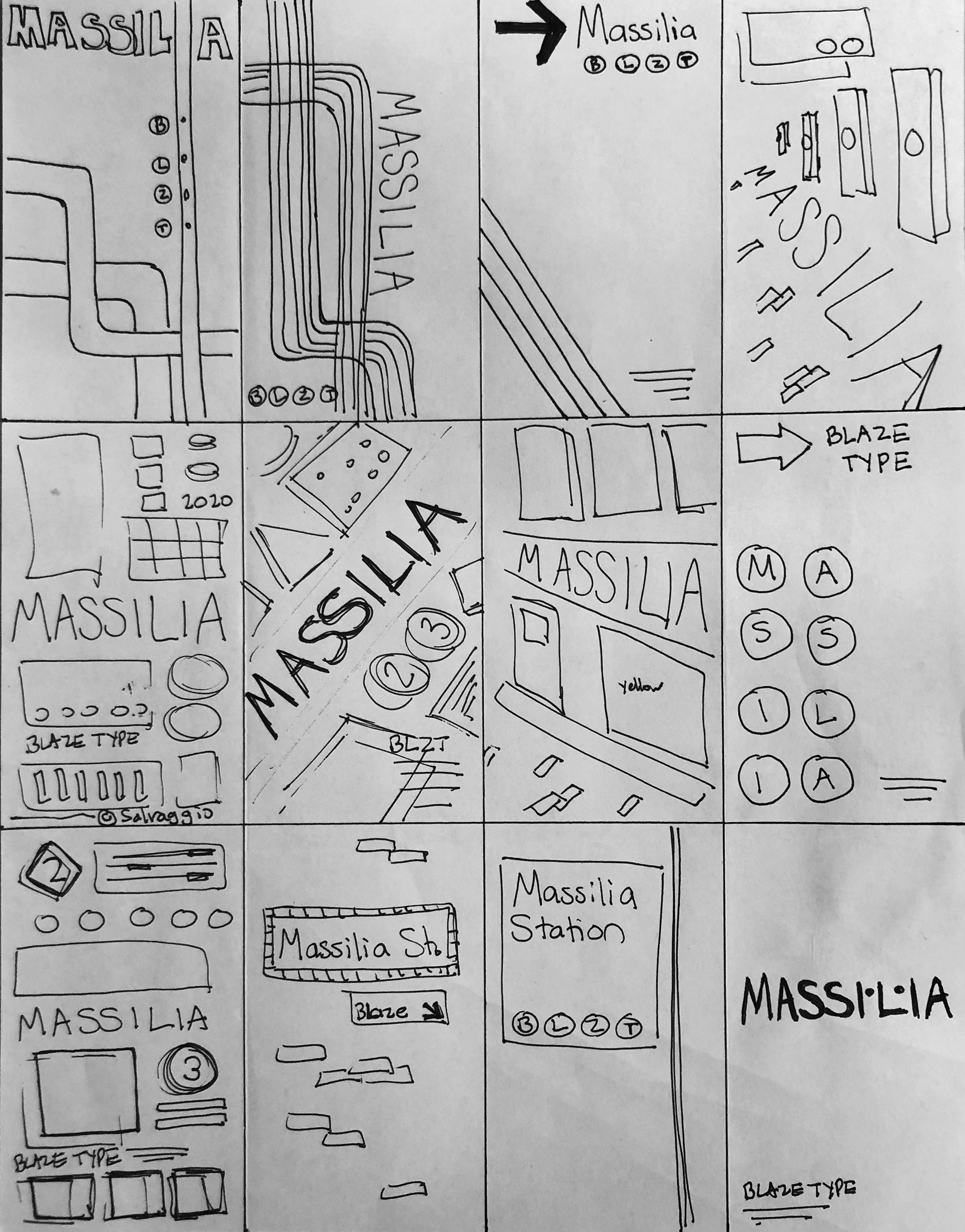
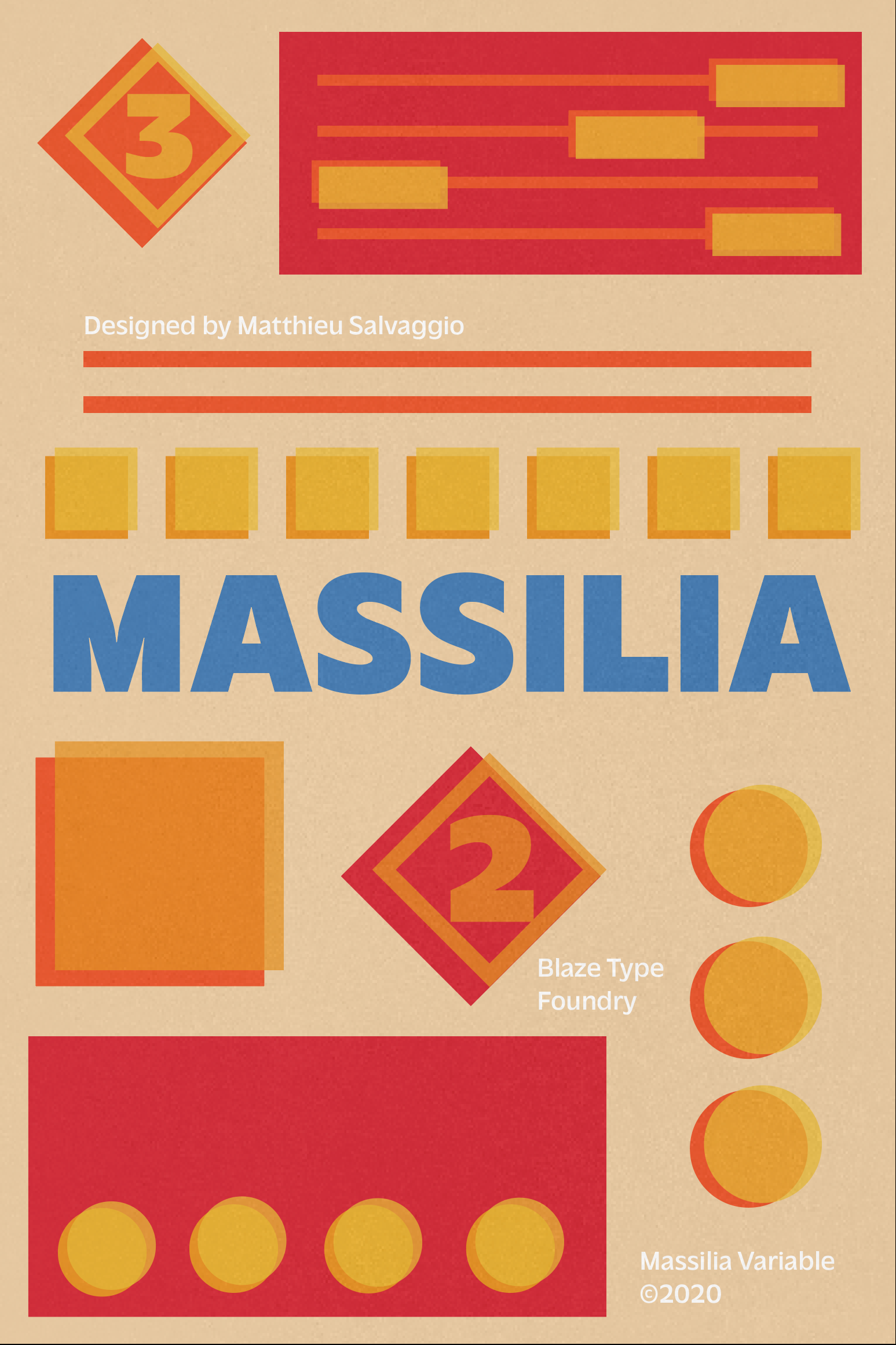
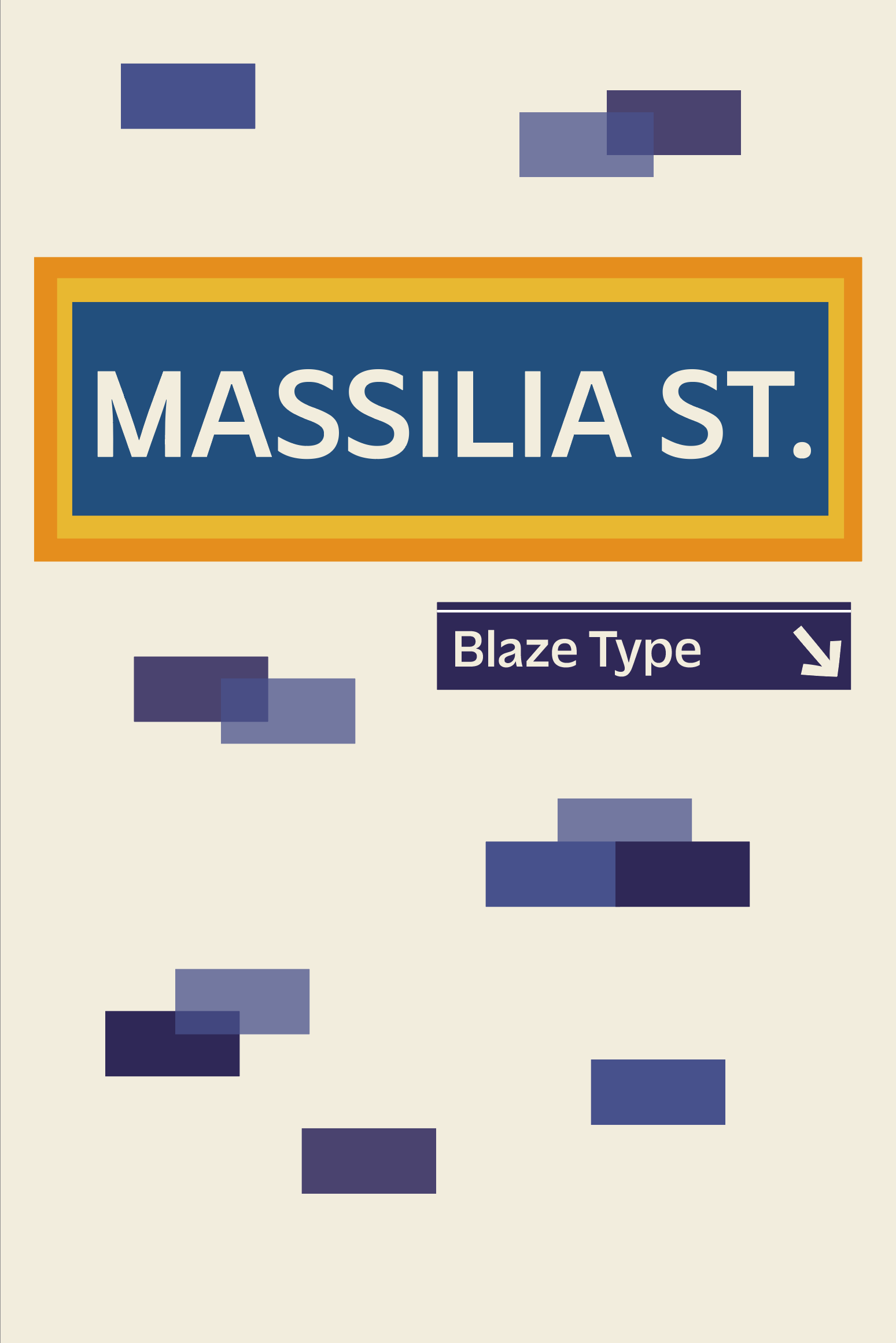
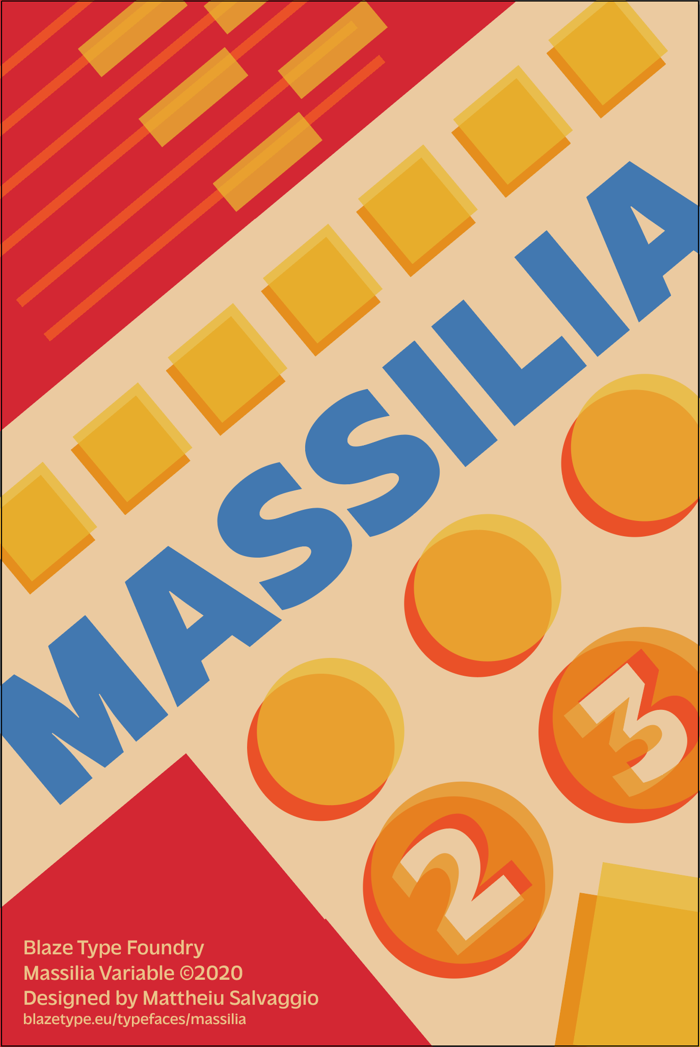
After creating some initial sketches and digitizing three favorites, I decided to continue with the diagonal version. Putting the text at an angle was the most dynamic and eye-catching, plus it included the overlapping shapes from my other options. After displaying the diagonal version for critique, I realized that my poster wasn't standing out amongst the rest and I had made a mistake in not including any contrasting elements or colors. I bumped up the contrast by adding a black background and the poster was well on it's way to its final version.
![](https://cdn.myportfolio.com/e582f9ee-eec6-4612-a087-5709729f3f68/bb2ffbc6-cb20-450a-ae56-1cfaa5196783_rw_1920.jpg?h=8f54d63499895824f379922bbbd7a8ee)
![](https://cdn.myportfolio.com/e582f9ee-eec6-4612-a087-5709729f3f68/ddbb6cb3-adf5-4b8c-82c8-dcb9aad801c7_rw_1920.jpg?h=1b8502086346c1cf86c94d5480b4b4a4)